As I mentioned in my previous post, I have been looking into asset allocation due to my concern about the both the stock market and the bond market in bubble territory. More and more articles are discussing the high valuation of the market, and attributing it to the abnormally low interest rates. It is rational to believe people are investing in the stock market only because there is no better alternative. I thought this article from John Mauldin had the best quote:
One of the keys to any bubble is usually loose credit and lending. To finance all the new consumer goods, in the 1920s installment lending was widely adopted, allowing people to buy more than they would have previously. In the 1990s, Internet companies resorted to vendor financing with cheap money that financial markets were throwing at Internet companies. In the housing boom in the 2000s, rising house prices and looser credit allowed more and more people access to credit. And a new financial innovation called securitization developed in the 1990s as a good way to allocate risk and share good returns was perversely twisted into making subprime mortgages acceptable as safe AAA investments.
Read more: http://www.businessinsider.com/mauldin-bubbles-bubbles-everywhere-2013-11
In this time of record (artificially) low interest rates we are seeing money being flooded into the marketplace, just like previous times of loose credit.
So during my asset allocation adventure, I was trying to decide what percentage of assets I want to invest in the stock market. My first inclination was to be real conservative. However, other investment alternatives offer little hope of capital appreciation, so if the bubble bursting is a ways off then that would be the wrong choice. So this let me to look at other strategies being used for mitigating stock market risk. I stumbled upon this paper by Mebane Faber and it alerted me to a technical indicator that I hadn’t applied to the stock market before.
The key takeaway is it appears you can mitigate stock market risk using a simple technical analysis tool – comparing the current S&P 500 index to its simple 10 month moving average. Faber uses the rule that if the market goes +1% above the 10 month moving average, that’s a buy indicator, and if it goes 1% below the 10 month moving average that’s a sell indicator. He backtested this model back to 1900 or so, and came out with superior market returns largely due to avoiding the large drops. While I have historically not invested much on technical indicators – this chart did impress me:
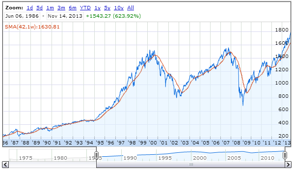
This is a chart of the S&P 500 since 1980, and the redline is a 10 month moving average. Note that if you followed the +1 / -1 rule in 2008, you would of under-weighted near 1400 on the S&P in June of 2008, then over-weighted again in November 2009 at around 880. The same is roughly true for 2001. Note that in even worked back to the crash of 1987.
I am in the process of looking at this a little closer, and backtesting various moving averages. One concern about the +1 / -1 rule is it seems on the surface it seems counter-intuitive you are using a rule to sell low and buy high. However, my eye keeps going back to this chart. I am still not sure I can fully trust such a simple indicator, but it is something worth keeping an eye on.